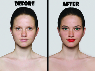
 While I've found a new found attraction to Illustrator, Photoshop and I still go way back. This was a pretty simple project that was spawned out of boredom more than anything else. I found an image of a girl without makeup and decided to doll her up a bit. DISCLAIMER: I BELIEVE IN A WOMEN'S RIGHT TO NEVER EVER WEAR MAKE UP AND STILL BE STINKING GORGEOUS. I could literally go on and on and on about how our society forces women to put on a mask, literally and figuratively, however, that's the the point of this post. For the sake of testing my Photoshop skills, I added digital makeup, even though the young women in the original image does not need it to be considered beautiful. Anyway, I started by changing up the skin tone and using the liquify tool to change her nose and ear shape, and add a bit of a smirk. The eyebrows were brought in from another image, as were the lashes. The rest is simple brush work, while playing with the blending options. The overlay option is literally your best friend when working on cosmetic edits. This took me a little less than an hour to complete, and overall it was a fun, short project!
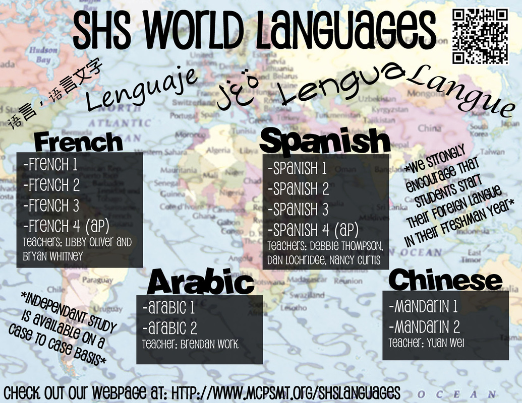
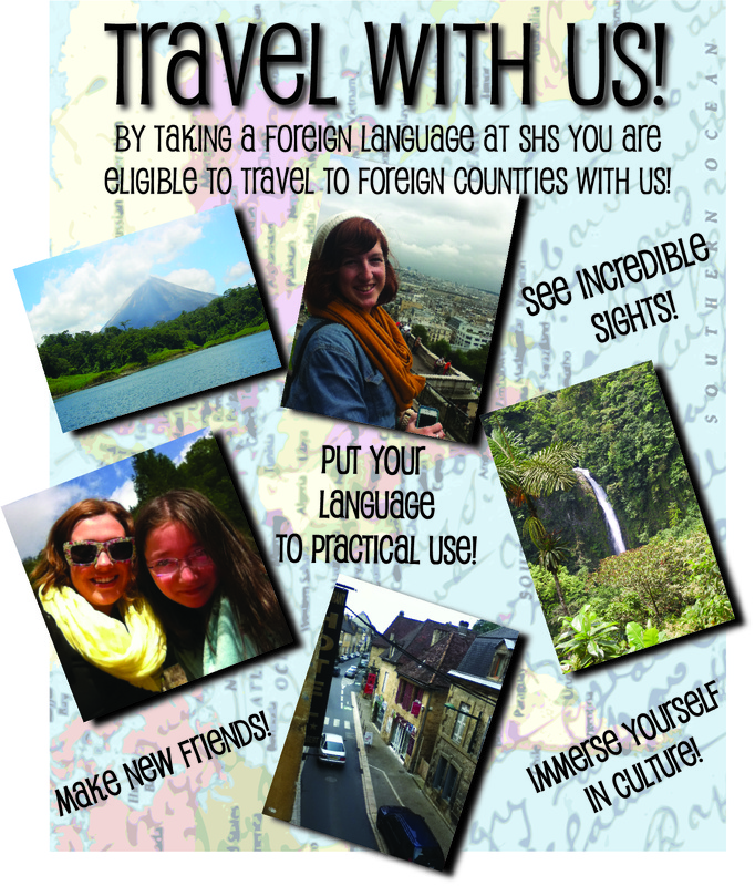
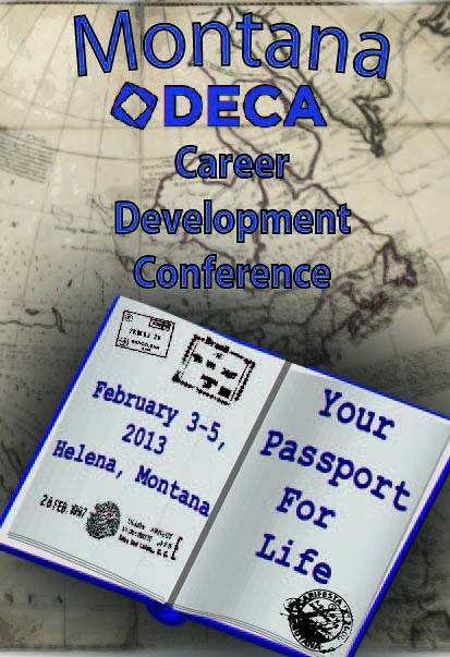
I know, I know, I know! It's been forever! Well I certainly haven't been dormant, on the design front, in fact it's the opposite! I've designed two different posters (one that won me some money!) and a double sided post card all in prep for Sentinel High School's big showcase night! I got to design both a travel poster and foreign language cards with a matching theme, and then just recently I created a program/poster for our state DECA competition...in Illustrator. Yes, I know. I. Am. A. Traitor. But quite honestly, I might just be falling in love with Illustrator! As much as I adore Photoshop, the 3D effects in Illustrator are a blast, and the interface can be super nice to use. Below are these three projects!
They were all fun to make, although I definitely learned the most on the DECA poster. I used 3D modeling to make the passport, and was challenged trying to make all of my typical effects in a new program. That plus the one day time frame, and $50 on the line, made it the first real design challenge I've faced this semester. I'm pumped to do some more work in Illustrator and maybe win some more contests!
 Ok, ok, I know. It's been almost a month since my last post! Shoot! But the truth is that I've been a busy little beaver doing all sorts of random jobs for school. Hopefully I'll get some of that work up here soon. However, for now, this is just a little taste of what I do in my spare time. :) This was inspired by a print I saw at the mall, but I knew that I could make it better. Ideally, I'd print it on canvas, but since I'm a poor student, this will have to do. I took one of my senior pictures, heightened the contrast, and then live traced it in Illustrator. I messed around with a bunch of the tracing settings, but in the end the simple black and white looked the classiest. Then I pulled it into Photoshop, added the fun text, and highlighted the words in Tiffany blue! Voila! A fifteen minute project with some great looking results! Comment with your thoughts!
So, you might notice a new page on the site! Whooooo! Basically, it's just a way for me to spread all of my Photoshop lovin' to the world! I've been creating some pretty simple tutorials for people to watch and get the gist of how I work with Photoshop. Check it out, and you might learn something!
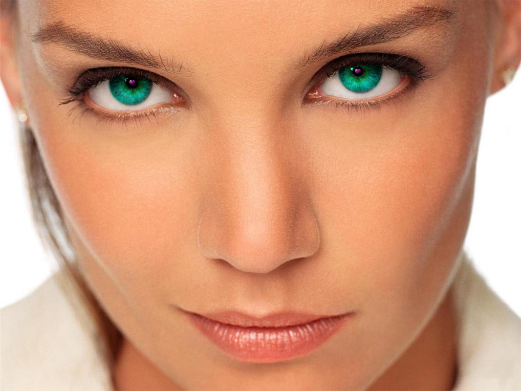
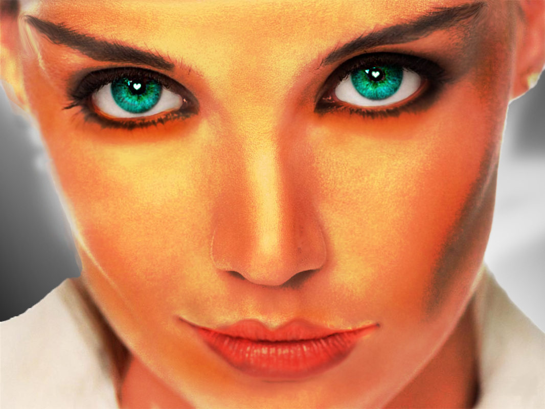
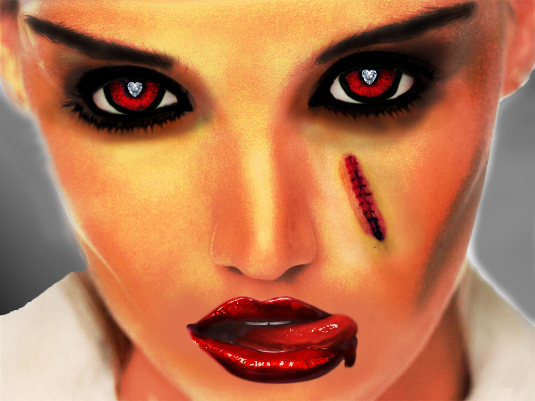
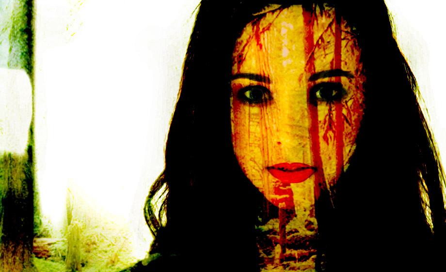
| It's official. IT IS ON! Ryan and I have officially started the most epic Photoshop war of all time. Really. So the premise is called Photoshop Ping Pong. You start with an image off of the web and make a change. Then you "pass" it to your oppenent and they make changes. To your right are the changes I've made. You can't put the original image onto any other images, but you can add auxilary images (lips, scar). The only other rule is that you can't undo changes that the other person has made. For example, Ryan added the scar, so I simply made it cooler. This is really stretching my skills, and I'm really enjoying the creative freedom! | |
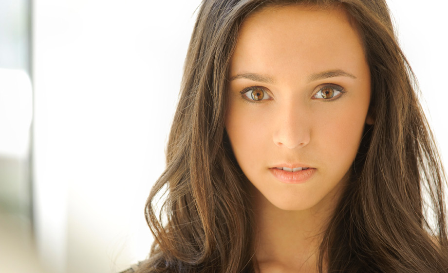
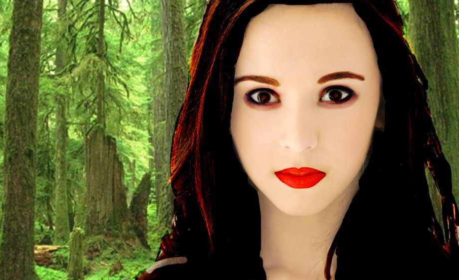
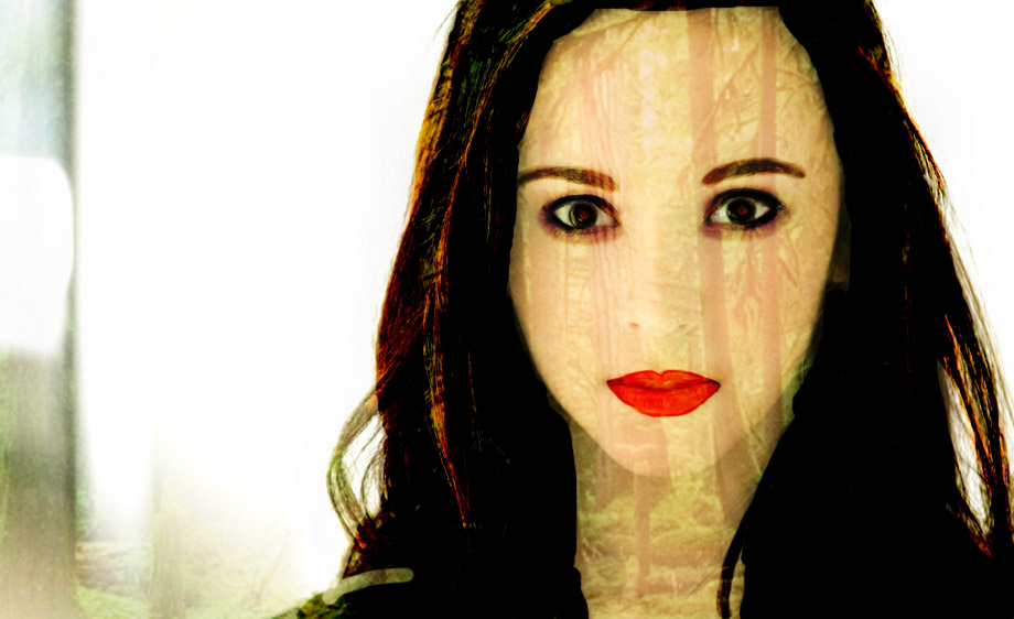
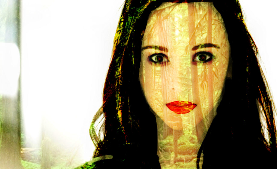
| | My video buddy Ryan and I decided that it was about time for a Photoshop war. Now, look to your left and behold the awesome, yet creepy products of my creative freedom. Fun stuff, am I right? Anyway, we both started with the first photo of a pretty normal girl. I mean, she looks nice, and pretty. Not for long. The next photo is what I was able to do after a couple days of messing around. I lightened her skin, closed her lips, changed her hair and eyebrows, and did a lot with her eyes. The subsequent images are what happen when I mess around with the blending mode. They're all slightly different looks, but my personal favorite is the last image. Just because of how the color burn mode blends the trees with her skin. Anyway, that's just a little tidbit of what I like to mess around with in Photoshop!
|
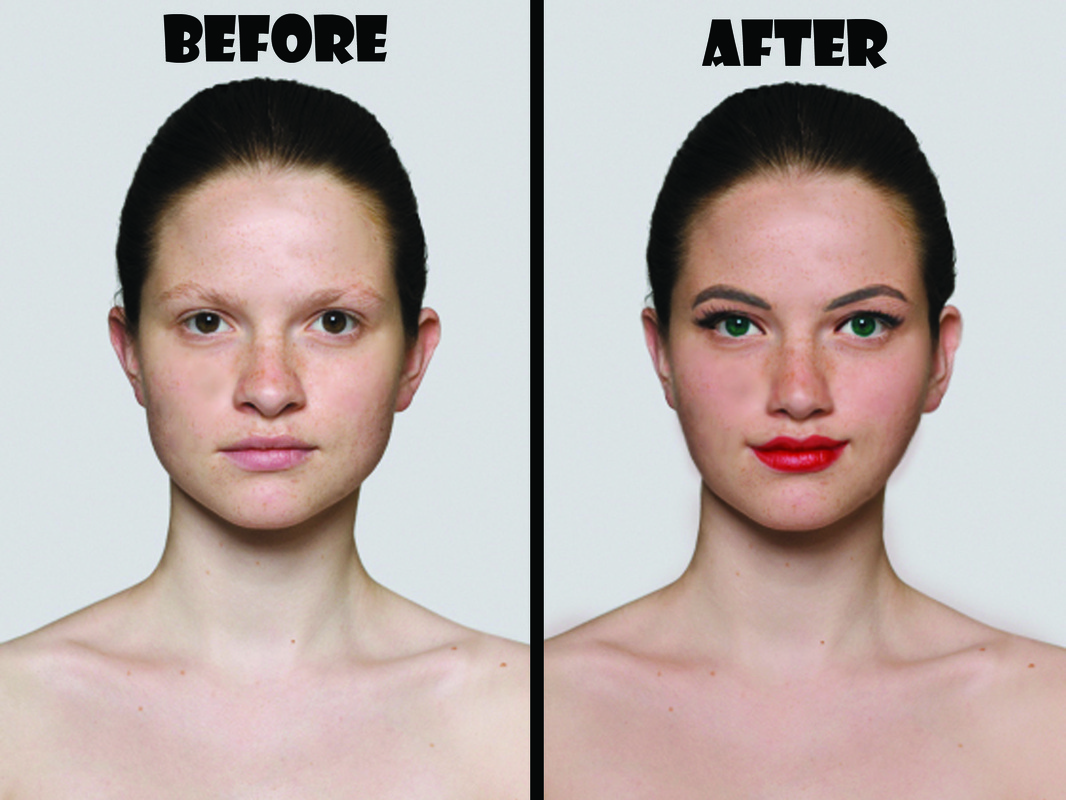
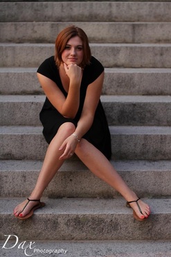
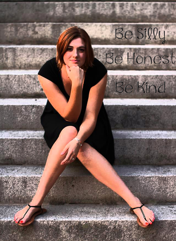
| | I recently went through the intense, yet awesome experience of getting senior photos taken! I was super duper nervous, but Dax Photography did an incredible job putting me at ease, and taking some wonderful shots! Of course he edited them to perfection, but I just like Photoshop, so I decided to mess with one. Here's the before and after images. I cropped it up a bit, added a film grain filter and added the text. I wanted the effect of the words being etched into the stairs so I added a bevel and some lighting effects. I love how the film grain brought out the texture of the stone and the highlights in my hair. The overall look is less senior picturesque and more artsy, but that's just fine with
|
Take a couple minutes and check out my most recent labor of love! We needed a recruitment video for my speech and debate team, and this came out of it! My video buddy, Ryan, taught me the basics and helped me to come up with this!
Look up! Now, look back down. Look up again! See that fancy little logo by the title? Yup...I made that. I've outlined my recent struggle with Illustrator below, just in case you care!
Considering I'm branding myself as a "dorky designer" I figured my logo better have geek glasses...and some sort of design element. Hence my Macbook Pro, Comet. Yes, I named my laptop Comet. Get over it. The only left was to add a bit of flair to the computer nerd logo. And that explains the sheet of paper which contains the 1st chapter of Pride and Prejudice. Yay early feminism! So after I though up all of these great ideas, I had to make it happen. Yipee.
Comet (Macbook)
In Illustrator, I created a gray rounded rectangle. then to create the Apple logo, I jacked an image off the internet and traced it with the pen tool. (Making sure to have small flaws, so i wasn't copying it completely.) I added a second, darker gray, rounded rectangle for dimension and presto! Comet came to life!
Paper
This element was pretty darn simple to create, even in Illustrator. I created a white rectangle with another darker rectangle behind it (my way of faking a drop shadow because I'm lazy.) Add a super small text box with Brush Script font and boom! Done.
Glasses
Now we meet the little twerp of the logo bunch. After TONS of trial and error, I finally managed a pretty decent result. I started by trying an Illustrator Live Trace on an image, but that didn't give me the transparent lenses. And then it begun...Transparency Hell. After many frustrating attempts in both Photoshop and Illustrator, I finally hit lens gold! I pulled an image into Illustrator of folded glasses. Then, I used my trusty pen tool to create two paths for the lenses. I filled these paths with a gradient of light blue, to white, to light blue. I set it at about 50% transparency so it actually looked like glass. Then came the moment of truth. I applied live trace and PRESTO! (finally. To add it to the logo, I pulled it into Photoshop and saved as a PNG, and Dorky Designer logo was created.
|

 RSS Feed